



Main Logo
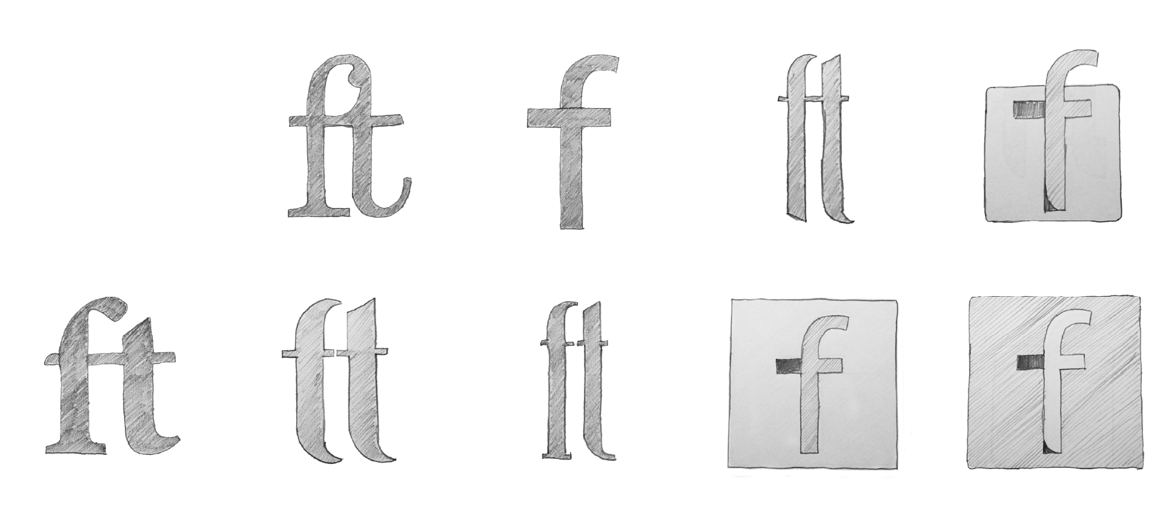
The logo exploration for FISHTALENT focused on integrating the initials F and T, as per the client’s requirement. Some designs merged them into a single form, while others kept them distinct. Variations included graphical symbols, square/circle balance frames, and linear and bold stroke approaches. However, heavier designs and symbol-based options were excluded due to scalability concerns. Final refinements were done in Adobe Illustrator for further exploration and application.


Design Brief
I began with the initial design brief and later discussed the current design, its theme, and the necessary changes for the new logo. The focus was on establishing a strong core idea to shape the brand's visual language.
After a detailed briefing and discussion, a clear direction for the identity was decided. To execute the brand identity, I started with rough sketches, mind mapping, and identifying key points from the brief. The concept emerged through this process, emphasizing the integration of F & T as a brand mark alongside the logotype.
Since this was a rebranding project, the goal was to refine the existing logo while making it relevant to the current design landscape and audience.
Rough Sketches


Typography
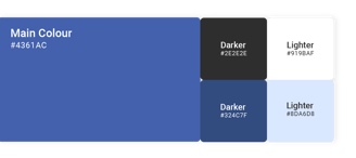
Colour
Mascot
Campaign
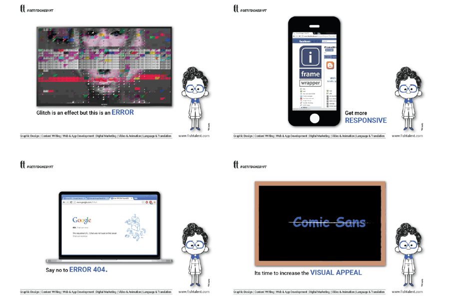


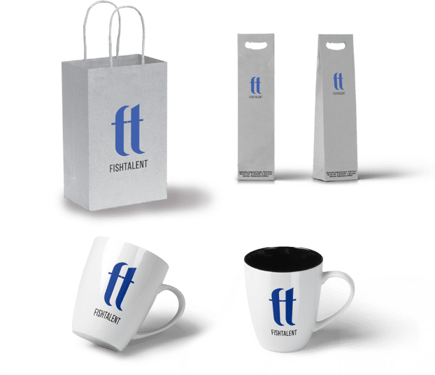
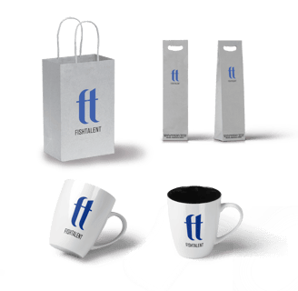
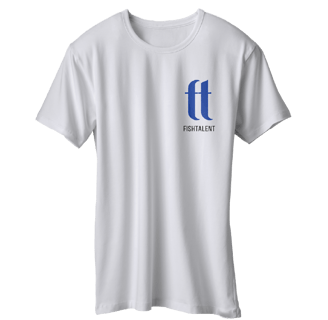
Merchandise

Sanket Shintre
Discover a realm where creativity meets precision. This portfolio is a curated showcase of innovative designs, compelling visual stories, and impactful communication strategies. Each project reflects a commitment to excellence, a passion for storytelling, and a keen eye for detail.
Contact
© 2025. All rights reserved.
Quick Links
